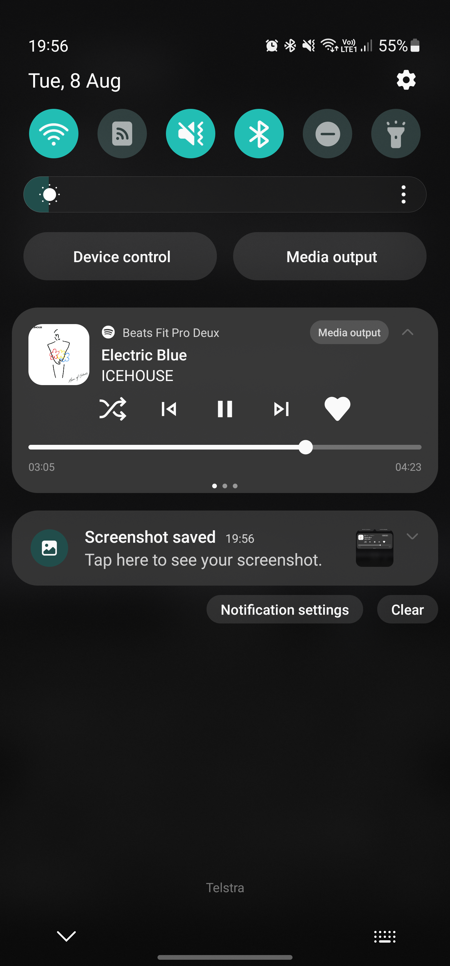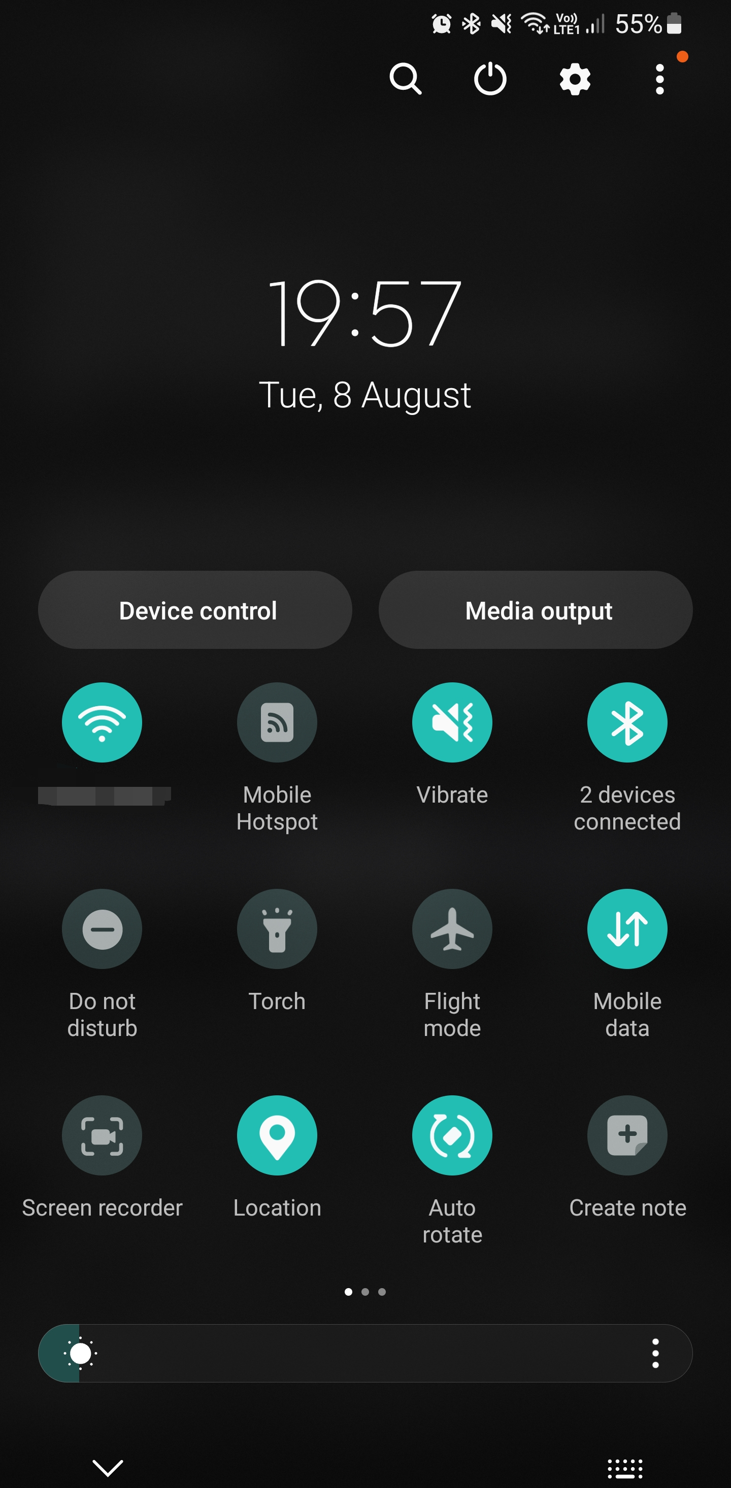

Hmm. What you’ve posted isn’t far off Samsung’s shade, except for some weirdly wide buttons at the top and a media controller that doesn’t add anything to the experience.
Yes it’s got minor but not insignificant aesthetic differences, but to say Samsung’s is awful and then hold this up as an example of good design… 🤔
Here’s my Samsung’s shade in its two positions (which can be changed to open fully on the first swipe if preferred).


I was referring to the weirdly wide buttons on his shade, not mine. :)